WPF에서 레이아웃을 구성하는 방법에는 Grid, StackPanel, DockPanel Canvas 등이 있습니다.
이번 게시글에서는 Grid와 StackPanel 사용법에 대해 정리합니다.
1. Grid
Grid는 보통 화면을 분할하여 사용하며 자식요소를 Grid의 크기만큼 당겨서 늘려주는 특징이 있습니다.
화면크기와 상관없이 일정한 비율로 화면을 나눌때 주로 사용하며
Grid는 xaml의 초기 셋팅레이아웃일 정도로 wpf를 대표하는 레이아웃입니다.
일정한 공간을 테이블식으로 나눠주고 그 내부에 자식요소를 넣어 사용합니다.
<Window x:Class="LayoutTest.MainWindow"
xmlns="http://schemas.microsoft.com/winfx/2006/xaml/presentation"
xmlns:x="http://schemas.microsoft.com/winfx/2006/xaml"
xmlns:d="http://schemas.microsoft.com/expression/blend/2008"
xmlns:mc="http://schemas.openxmlformats.org/markup-compatibility/2006"
xmlns:local="clr-namespace:LayoutTest"
mc:Ignorable="d"
Title="MainWindow" Height="450" Width="800">
<Grid>
<Grid.ColumnDefinitions>
<ColumnDefinition Width="1*"></ColumnDefinition>
<ColumnDefinition Width="1*"></ColumnDefinition>
</Grid.ColumnDefinitions>
<Grid.RowDefinitions>
<RowDefinition Height="1*"></RowDefinition>
<RowDefinition Height="1*"></RowDefinition>
</Grid.RowDefinitions>
<Grid Grid.Column="0" Grid.Row="0">
<Button Content="버튼1"></Button>
</Grid>
<Grid Grid.Column="1" Grid.Row="0">
<Button Width="200" Height="80" Content="버튼2"></Button>
</Grid>
<Grid Grid.Column="0" Grid.Row="1">
<TextBlock Text="안녕하세요" VerticalAlignment="Center" HorizontalAlignment="Center" Background="LightGreen"></TextBlock>
</Grid>
<Grid Grid.Column="1" Grid.Row="1">
<TextBlock Text="안녕하세요" VerticalAlignment="Center" TextAlignment="Center" Background="LightBlue"></TextBlock>
</Grid>
</Grid>
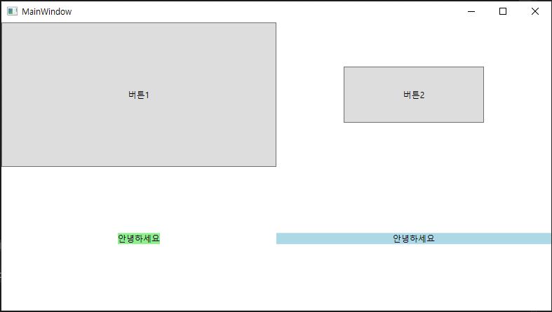
</Window>화면을 4등분하고 버튼, 사이즈를 조절한 버튼, 가운데 정렬한 두개의 TextBlock 예제입니다.
1. 0,0 그리드
-사이즈를 조절하지 않은 버튼은 Grid 전체를 채우는 것을 확인할 수 있습니다.
2. 1,0 그리드
-버튼의 사이즈를 조절을 했더니 가운데정렬이 된 것을 확인할 수 있습니다.(grid는 동서남북에서 당겨주는 특징이 있습니다.)
3. 0,1 그리드
-TextBlock은 VerticalAlignment, HorizontalAlignment을 이용해 가운데 정렬을 하였습니다.
VerticalAlignment속성을 이용하면 Textblock의 크기를 조절한 것 처럼 TextBlock은 내부의 Content의 크기에 맞게
조절됩니다.
background를 넣어서 해당요소의 특징을 확인해 볼 수 있습니다.
4. 1,1 그리드
1,0의 TextBlock은 HorizontalAlignment 대신 TextAlignment를 이용해 가운데 정렬을 하였습니다.
글자만 정렬하라고 지시했더니 글자만 정렬해주고 Grid의 특징으로 좌우로 당겨주는 모습입니다.
background를 넣어서 해당요소의 특징을 확인해 볼 수 있습니다.
2. StackPanel
StackPanel은 내부에 아이템들을 넣어 한줄씩 쌓는 레이아웃입니다.
안드로이드의 리니어레이아웃과 유사합니다.
<Window x:Class="LayoutTest.MainWindow"
        xmlns="http://schemas.microsoft.com/winfx/2006/xaml/presentation"
        xmlns:x="http://schemas.microsoft.com/winfx/2006/xaml"
        xmlns:d="http://schemas.microsoft.com/expression/blend/2008"
        xmlns:mc="http://schemas.openxmlformats.org/markup-compatibility/2006"
        xmlns:local="clr-namespace:LayoutTest"
        mc:Ignorable="d"
        Title="MainWindow" Height="450" Width="800">
    <StackPanel Orientation="Vertical">
        <TextBlock Text="안녕하세요" HorizontalAlignment="Center" Background="Lime"></TextBlock>
        <TextBlock Text="안녕하세요" TextAlignment="Center" Background="LightBlue" Width="150px"></TextBlock>
        <TextBlock Text="안녕하세요" TextAlignment="Center" Background="Aqua"></TextBlock>
        <Button Content="버튼1"></Button>
        <Button Content="버튼2" Height="50"></Button>
    </StackPanel>
</Window>
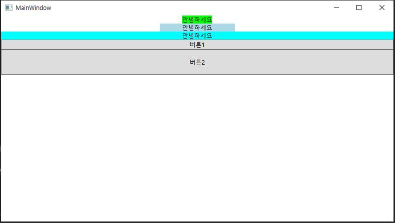
Orientation속성을 이용해 수직으로쌓을지 수평으로 쌓을지 결정 할 수 있습니다. 저는 수직으로 쌓았습니다.
Orientation을 지정하고 내부아이템들의 height나 Width를 조절하여 해당 요소의 크기를 조절하곤 합니다.
Orientation을 Vertical로 지정하면 부모의 높이는 내부 아이템의 높이로 지정이되며 넓이는 부모의 크기에 맞춰지는걸 볼 수 있습니다.(크기를 조절하면 좌우로는 당겨주고 있으니 가운데 정렬이 됩니다.)
3. 구글 메인페이지 따라 만들기
Grid와 StackPanel을 사용해 구글 메인페이지를 따라 만들어 보겠습니다.

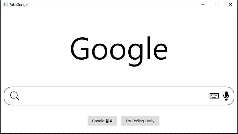
2020년 9월 28일 기준 구글 메인페이지는 이렇게 생겼습니다.
저는 이렇게 만들겠습니다.
먼저 그리드를 위아래로 삼등분을 해준뒤(3:1:1비율)
1, 위쪽 그리드에는 Google 텍스트블럭넣기
2. 가운데 그리드에는 테두리를 넣고 스택패널(가로방향)을 넣어 돋보기, 텍스트박스, 키보드, 마이크 순으로 넣기
3. 아래쪽 그리드는 다시 좌우로 그리드분할을 한 뒤, 버튼을 넣어주고 정렬하기
<Window x:Class="FakeGoogle.MainWindow"
        xmlns="http://schemas.microsoft.com/winfx/2006/xaml/presentation"
        xmlns:x="http://schemas.microsoft.com/winfx/2006/xaml"
        xmlns:d="http://schemas.microsoft.com/expression/blend/2008"
        xmlns:mc="http://schemas.openxmlformats.org/markup-compatibility/2006"
        xmlns:local="clr-namespace:FakeGoogle"
        mc:Ignorable="d"
        Title="FakeGoogle" Height="450" Width="800">
    <Grid>
        <Grid.RowDefinitions>
            <RowDefinition Height="3*"></RowDefinition>
            <RowDefinition Height="1*"></RowDefinition>
            <RowDefinition Height="1*"></RowDefinition>
        </Grid.RowDefinitions>
        <Grid Grid.Row="0">
            <TextBlock Text="google" VerticalAlignment="Center" HorizontalAlignment="Center" FontSize="100"></TextBlock>
        </Grid>
        <Border Grid.Row="1" Margin="10" CornerRadius="25" BorderBrush="Gray" BorderThickness="2">
            <StackPanel Orientation="Horizontal">
                <Image Source="search.png" Stretch="Fill" Width="30" Height="30" Margin="20,0,0,0"></Image>
                <TextBox Width="630" BorderBrush="White" FontSize="20" VerticalAlignment="Center"></TextBox>
                <Image Source="keyboard.png" Stretch="Fill" Width="30" Height="30" Margin="0,0,10,0"></Image>
                <Image Source="mic.png" Stretch="Fill" Width="30" Height="30"></Image>
            </StackPanel>
        </Border>
        <Grid Grid.Row="2">
            <Grid.ColumnDefinitions>
                <ColumnDefinition Width="1*"></ColumnDefinition>
                <ColumnDefinition Width="1*"></ColumnDefinition>
            </Grid.ColumnDefinitions>
            <Button Grid.Column="0" HorizontalAlignment="Right" Height="35" Width="100" Margin="0,0,5,0" BorderBrush="White" Content="Google 검색"></Button>
            <Button Grid.Column="1" HorizontalAlignment="Left" Height="35" Width="130" Margin="5,0,0,0" BorderBrush="White" Content="I'm Feeling Lucky"></Button>
        </Grid>
    </Grid>
</Window>
4. 실행화면
가운데 그리드안에 스택패널을 넣지않고 그리드를 넣어도 상관없습니다.(앱을 사용하는 화면의 크기가 고정되지 않았다면 화면을 비율로 차지하는 Grid를 사용하는게 더 이상적입니다.)
대신 Grid는 화면구성이 바뀔경우 수정이 까다로운 반면 StackPanel은 수정이 비교적 용이하다는 장점이 있으니
적재적소에 필요한 레이아웃을 사용하시면 되겠습니다.
'wpf > wpf layout 및 문법' 카테고리의 다른 글
| [wpf] WPF ListView 사용법 및 예제 - 1 - (0) | 2020.10.02 |
|---|---|
| [wpf] MessageBox 사용법 및 예제 (0) | 2020.10.01 |
| [wpf] 화면 이동하기 -3- TabControl 사용법, 예제(wpf 탭) (0) | 2020.09.18 |
| [wpf] 화면 이동하기 -2- Window 사용법, 예제(사용자 입력 받기) (4) | 2020.09.18 |
| [wpf] 화면 이동하기 -1- Page 사용법, 예제 (2) | 2020.09.18 |


댓글